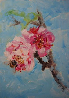
Quite happy with this one now. The photo below shows what it looked like in its first incarnation. I had considered it finished but wasn't really happy with it. I had to whiz out for a dental appointment and when I came back I decided I really didn't like it at all. I decided I'd risk overworking it to try for a better outcome, so I'm glad I took the risk. Although, I suspect the bee looked better in the first version.
I've noticed that so many things I'm painting lately seem to have a predominance of blue.
Below is my reference photo taken of my flowering peach tree in a very ugly corner of the backyard.


I think you made a good decision with the sky colored background. It it makes the flowers and bee more unified.
ReplyDeleteLove the way you paint.
Thanks so much for visiting Julie and for your kind comments. I love your latest challenge painting!
DeleteThe light blue background works beautifully with the pink blossom and leaves the focus on the flower and bee. Blue is one of my most used colors too.
ReplyDeleteThanks Celia, I'm pleased to hear that you use a lot of blue too. I won't resist it now that I know others also find the same thing.
DeleteI like your later version. Having the blue in the entire background makes your flowers stand out. I think the bee shows better too.
ReplyDeleteThanks so much Nancy! I really enjoyed visiting your blog!
DeleteOkay Wendy! Now that is what I'm talking about! Love this one. Love seeing the stages in its development!
ReplyDeleteI love, love,love all the blue you went with on the final piece. Brings great action, excitement and movement! "Deep greens and blues are the colors I choose!" James Taylor from "Sweet Baby James!"
Oh, the bee looks great in both versions!
Keep on painting and taking risks once in a while! Or more than once in a while? Your choice! Which is why being an artist is so very, very cool and fun!
With so much ocean around you of course you love the color blue! Why not! The ocean is such a joy for me my buddy!
Take care and G'Day Mate!
( I am such an Australian "Wanna Be!")
Michael "Cobber" Perchard (New middle name looks pretty good?)
Thanks so much Michael for your most enthusiastic encouragement! I'm glad you like how it turned out in the end. I have felt inspired to take more risks with this challenge. I also find that you are an inspiration for walking on the wild side when it comes to painting. You always get great drama and originality into your paintings.
DeleteYes, the middle name suits you!
Love your latest wild ocean!
Art Cobber Wendy.
Wendy, you absolutely made good decisions in your "redo!" And really, there's nothing wrong with blue; I think it's everyone's most used color simply because there is so much of it around us! And your bee shows up much better against the blue background.
ReplyDeleteThanks so much Cindy. Yes, you are right, I won't hold back on the blues any more!
DeleteExcellent Wendy, both the flower and the bee are beautiful !
ReplyDeleteThanks so much Jane!
DeleteThe flowers are the focus Wendy...they are beautiful, what a great job!! Thanks for the comments on the Dune grass, it was from a beach in Perth,(can't remember the name) when we were there last year.
ReplyDeleteThanks Karen! I had thought that the dune grass you painted looked very similar to what I see around here. That explains why! You did a lovely job with it.
DeleteI love this! Your bee's wings are great! They look translucent, like the real thing.
ReplyDeleteThat's very kind of you to say so Kaethe! The detail you achieved in your dragonflies' wings was astounding!
Delete